Statistics
- Charts
- Measuring Central Tendency
- Measuring Spread
- Measuring Variability
- Probability
- Appendix
- Bibliography
Charts
Pie chart
- Used to visualize proportions
- Never use percentage as proportions
Bar chart
- Prefer horizontal bar chart when the category names are longer.
- Segmented bar chart is used to show both frequency and percentage.
Histogram
- Histogram’s bar area must be proportional to frequency.
- Frequency Density = Frequency / Group Width
What is the difference between Histogram & Bar chart? * Widths are constant in bar charts. It varies in histogram. * No gaps between bars in histogram.
Line Chart
- Use only for numerical data. Never for categorical data.
Rule: When using percentages in charts, show frequency also.
What type of chart to use?
| To show | use |
|---|---|
| Category + Frequency | Pie chart |
| Category + Percentage | Bar chart |
| Category + Frequency + Percentage | Segmented Bar |
| Range of numbers + Frequency | Histogram |
| Range of numbers + Cumulative Frequency | Line chart |
Measuring Central Tendency
There are 3 types of average: Mean, Median & Mode.
Mean ($\mu$)
- Outliers - An extreme high or low value that stands out from the rest of the data.
- Skewed Data - When outliers pull the data to the left or right.
Median
- Sort and find the middle value.
- Use this when the data is skewed.
- Can fluctuate if the data is symmetrical.
Mode
- Most frequent value. There can be more than one mode in a data set.
- Bimodal - data set with 2 modes
- Group / category with highest frequency is
modal class - When to use?
- When the data is categorical
- For the data with clusters
- When not to use?
- When there are many modes.
Measuring Spread
Range
- The range is a way of measuring how spread out a set of values are. It’s given by:
range = upper bound - lower bound. - The range only describes the width of the data, not how it’s dispersed between the bounds.
- Range value is misleading when there are outliers.
Quartiles
- Quartiles are values that split your data into quarters.
- The lowest quartile is known as the lower quartile, or first quartile (Q1), and the highest quartile is known as the upper quartile, or third quartile (Q3). The quartile in the middle (Q2) is the median, as it splits the data in half.
- The lowest quartile is called the lower quartile (Q1), and the highest quartile is called the upper quartile (Q3). The middle quartile is the median.
- Interquartile Range (IQR) - is the range of central 50% of the data between lower and upper quartiles. You find it by calculating
Upper quartile - Lower quartile. - Box and whisker chart or Box plot is used to visualize the range, IQR and median.
Percentiles
- If you break up a set of data into percentages, the values that split the data are called percentiles. For example, if the data is split into tenths (10% each), then the values are called deciles.
- Pk is the value k% of the way through your data. If you scored 50 and knew that P90 = 50, you’d have beaten or matched the score of 90% of other people.
- Quartiles are a type of percentile. Q1 is P25, Q2 is P50 and Q3 is P75.
- We can use percentiles to construct a new range called the interpercentile range.
Measuring Variability
Variance & Standard Deviation ($\sigma$)
- The variance is a way of measuring spread, and it’s the average of the distance of values from the mean squared.
- For faster variance calculation, use below formula. Here you don’t have to calculate ${\Sigma(x-\mu)^2}$ for every number.
- Standard Deviation is a way of saying how far typical values are from the mean. The smaller the standard deviation, the closer values are to the mean. The smallest value the standard deviation can take is 0. $\sigma = \sqrt{variance}$
Standard Score ($z$)
- Standard scores give you a way of comparing values across different sets of data where the mean and standard deviation differ. They’re a way of comparing related data values in different circumstances. $ z = \frac{x - \mu} {\sigma} $
- You find the standard score of a particular value using the mean and standard deviation of the entire data set.
Example: Imagine a situation in which you have two basketball players of different ability. The first player gets the ball into the net an average of 70% of the time, and he has a standard deviation of 20%. The second player has a mean of 40% and a standard deviation of 10%. In a particular practice session, Player 1 gets the ball into the net 75% of the time, and Player 2 makes a basket 55% of the time. Which player does best against their personal track record?
| Player 1 | Player 2 | |
|---|---|---|
| $x$ = 75 | $x$ = 55 | |
| $\mu$ = 70 | $\mu$ = 40 | |
| $\sigma$ = 20 | $\sigma$ = 10 | |
| $z1 = \frac{75-70}{20} = 0.25$ | $z2 = \frac{55-40}{10} = 1.5 $ |
Probability
Basics
- Event - An outcome or occurrence that has a probability assigned to it
- Probability = (# of ways of winning) / (# of possible outcomes)
P(A) = n(A) / n(S)
where
- P(A) - probability of event A occurring
- n(A) - number of ways of getting an event A
- n(S) - number of possible outcomes
- S - possibility space or sample space
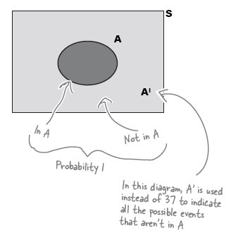
Complementary event
- AI is the complementary event of A. It is the probability that event A does not occur.
P(A) + P(AI) = 1
- Use Venn Diagram to easily visualize the probabilities
- Adding probabilities - e.g., what is the probability of getting an even number in a dice throw.
Exclusive events
- If two events are mutually exclusive, only one of the two can occur. e.g., head and tail in a coin toss
Intersection events
- If two events intersect, it’s possible they can occur simultaneously. e.g., black and even number in roulette
- i$\bigcap$tersection
- $A \bigcap B$ refers to intersection between event A and B.
- Think of this symbol as and
- $\bigcup$nion
- $A \bigcup B$ refers to union of A and B. It includes all of the elements in A and B.
- Think of this symbol as or
- If $A \bigcup B = 1$, then A and B are said to be exhaustive. Between them, they make up the whole of S.
where
- Mutually exclusive events have no elements in common with each other, so
Conditional probabilities
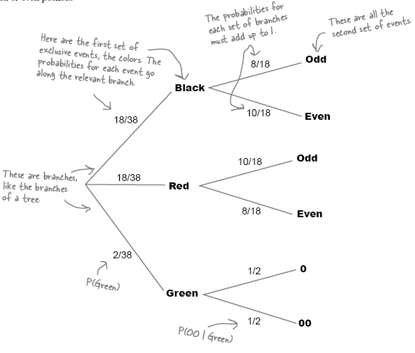
- measures the probability of an event occurring relative to another occurring.
-
it is represented by pipe symbol. e.g., P(A B) is read as the probability of A given that wek now B has happened. - conditional probabilities are best visualized using probability tree.
which means
Appendix
About Roulette Wheel
- It has 38 pockets that the ball can fall into.
- The main pockets are numbered from 1 to 36, and each pocket is colored either red or black.
- There are two extra pockets numbered 0 and 00. These pockets are both green.
Bibliography
- Head First Statistics